Though i am not from QA background but after more than three years of working in this rendering issues field i have seen many varieties of font problems. I am writing some of area where we should look while testing fonts. This is just some guidelines please suggest me if any you can.
Steps:
1. Cross check font with Unicode chart:
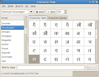
This is very important step, use tool like character map in Fedora, charmap in windows. These tools show you glyphs in font and corresponding Unicode value. Just check this with Unicode code chart www.unicode.org/charts. There is chances of wrong Unicode value assignment to glyph and also possibility of missing important Unicode characters. Please check the Unicode version font supporting so it will be nice to check particularly with same version of Unicode chart.

2. Create a test file for your language:
The content of this file should be all possible syllables of language, say for marathi it will be barakhadi(combination of all consonant+ matras). It should also contain some conjuncts form ex. matra ligatures, consonant ligatures. Making this file is really big effort but doing so once will help you forever for testing fonts. I think there should be some available for some script already. So please surf net.
I will really appreciate people from community if they have such file please submit that file it will help lots to others peoples also.
So when you testing any new font for your language just apply that font to this file and check whether it is working properly or not. In case of any doubt you can refer to all ready available accurate font for cross checking.
Problems of this file can be, since you are not actually typing the characters, there are chances of source file might have typed using wrong typing sequence. Since we are just viewing that we cant be sure what person has entered while typing it. So i suggest please in case any doubt type actually that character sequence.
Example: Once i took some data from esakal.com for testing but some characters were not rendering properly, letter on i understood there data entry operators are typing ZWJ in many unnecessary places also(almost every places where half form's of consonant comes).
3. Problems of rasterizer:
Many times it happens, due to problem of hinting rasterizer shows some wrong GPOS attachments. In this case please increase the font size and check, else just take a printout of this doc and check.
I have noticed this problem while working of nastalliq script font, cursive attachment is key point of nastalliq script and on screen it was showing break in cursive attachment but in GPOS rules of font and in print paper it was showing properly, so it was problem from rasterizer side.
4. Compatibility Issues:
This is major problem of Open Type Fonts. Open Type Fonts gsub rules give different results according to rendering engine's reordering methodology.
So even though our test file gives nice results on gedit, it might not give same results on kwrite/openoffice since they use different rendering engine.
It will not give 100% different behavior but there are chances of some bugs. So please dont forget to do this.
5. Font Styles: (Normal, Italic, Bolt and Bold Italic etc)
check is it possible to apply all styles to font (Bold, Italic, Bold Italic)
I have seen this problem while creating Arabic fonts, even though after installing for weights of fonts(N, I, B and BI). When i was trying to see actually effect it was not showing me style variations. After digging into it i understood some problem of .fog(source file) file setting. I was not updating name of TTF names field.
Testing styles is very difficult task since many editor give inbuilt support for italics, bold. So checking the glyph we are watching, is from Italic font or is this default italic given by editor is very important. I was doing so by taking printout :).
First take printout of default italic given by Editor. Then Install Italic weight of Font take printout. Now compare things will give you exact results.
6. Fonts internal name:
Whenever we double click on any True Type Font it shows us its name, license information etc. In gnome it is gnome-font-viewer, in windows windows-font-viewer these viewer shows this information.
Testing this thing is also very important. Since this is the name we identify while selecting font in various editors(OO, gedit etc).
So test is this font-name shows as expected in Editor. ex. 'samyak devanagari' while selecting font in menubar.
7. Selecting Font:
Actually applying font to text. Some time editors don't allow us to do this. I have see this problem with Ms Office. After installing a font it was not allowing me select one from list.
The problem in this case is unicode bits in OS/2 are not set properly for script.
http://www.microsoft.com/typography/unicode/ulu.htm
Fontforge and Fontlab font editors do this, just we need to select required script. But people who are still using Fontographer need to give this by writing Hexa value for that script range.
8. Printing Quality:
Shapes we see on screen are result of hinting, anti-aliasing and some more processing of rasterizer also screen-resolution also effects on it.
Check by taking printout: It will shows how font looks in printed material, might be you can suggest some modification in glyphs.
Yes definitely we should check this with different kind of printer dot-matrix, laser, inkjet. It actually tell you the printing quality of your font :)
That's why you can seen many varieties of font today for different media(display, print etc)
please don't forget to mention version off all application with OS name while filing bug. Also if you are giving key name of ASCII keyboard, please mention which keyboard layout you are using ex. inscript, phonetic etc